Thursday 6 January 2011

Production - ITAP

  • The Experts
  • From Novice to Expert
When observing the long process of considering oneself an 'expert' at something, there are ways of defining each level of garnered knowledge and in turn creative, demonstrational and organisational ability. Int his particular ITAP, we viewed a chart aiming to describe and evaluate these steps.
When evaluating my own work in relation to these experience presets, I looked at each of the criteria and in turn realted them to my own work (shown right). I would have to conclude that my experience and skill level varies greatly when considering terms as simple as illustrative style. Therefore, I have chosen to critically observe my manga-style artworks and knowledge, which I have been practicing since an early age originally due to media influence and an interest in the visuals of Japanese animation.
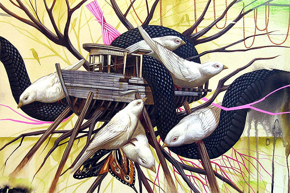
I could say I consider myself between competent and proficient in this area as opposed to being a novice through to beginner. This is due to several factors. I have a high understanding of the origins and continuing culture of the subject area, as well as the visual techniques employed to create the most effective images; composition/signs/colour/tone/subject/visual heirachy etc. Over nearly 10 years my manga-influenced works have become more consistenltly visually and personally rewarding, backed up by a relatively high internet following and continued positive reactions. No assistance in creation is required and I am able to deal with problematic aspects of an image by either restating or reworking. When creating an image, I view the wider 'picture' by taking into account my online audience, the broader outlay of a character's world and the way in which they are visually presented.


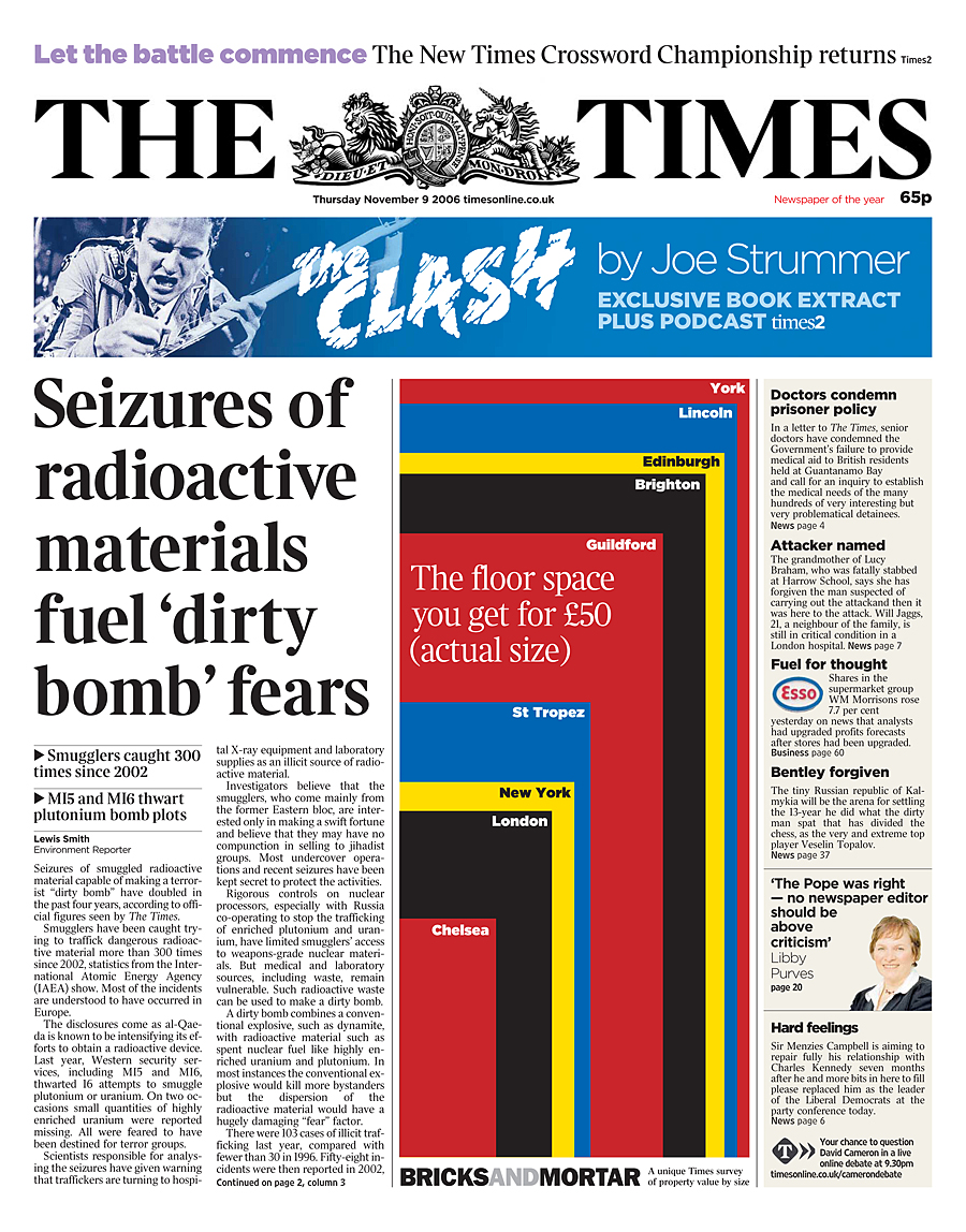
Looking at the expert graphic designers observed in this particular ITAP lecture, the typographical work of Neville Brody stands out due to both it's familiarity and effective use of visual variation within the given framescale. His layout for the new compact version of The Times are proving a huge factor in the iconic nature of the paper, recognized nationally and even globally. His choice of composition, font and aspect sizing all donate to it's reputation as a more distinguished chronicle than most competition, with headlines avoiding feeling somewhat sensational and loaded through their modest size and relatively slim typeface. Text is neatly divided into seperate stories, yet pages are full and still boldly illustrated, whether this be photographically or graphically. Brody's work is an excellent reflection of how the intent of a piece can be demonstrated; visuals affect audience broadity, the literal information contained within, in which order we view it, and even the expected price. If published material appears to have alot of content from the way in which it is presented, the economical value can become greater. Although we may not realise when picking up a broadsheet or indeed mini-version, image choices themselves can affect and define opinion making his work very powerful.
Another principle previously discussed in these blog posts is that of visual heirachy. In this case, and in the wider case of composing text for publishing, this is heavily utilized by the designer. Although all aspects of the cover are somewhat in competition, the layout of these are meticulously placed to define what we as an audience will view first - as aforementioned, a huge part of the power of media. Subconciously or not, we take notice of what corporations want the public to absorb. Selective placing for full power of intent.

Wednesday 5 January 2011

Development of Creative Thought and Structure in Illustration and Graphic Art

Key principles
  • Overcoming Mindsets
  • Restating Problems

To overcome preconcieved ideas about just about anything in life, we must first challenge convention, and in turn conventional approaches to problems and ways of thinking. Preconceptions are often formed well within our desired comfort zone and from previous experiences, whether this be in regards to general opinions, morals, actions and indeed art. From an illustrative and visual perspective, our mindset can lead us to create images which could be considered unoriginal or unexciting; boundaries are not pushed and reactions are not extreme. Convention can be considered the norm, average. In all forms of art, thinking and breaking outside the box can open a whole range of creative opportunities.
We can think about this in terms of the basics. Colour, composition, texture, tone, intent, media, medium, meaning, signs, messages. After establishing this principle, we can begin an entirely new visual language; unique to the creator.

A good example of an artist who utilizes this principle to aesthetically-stunning effect is American tattooist and painter Shaun Barber. His oil and acrylic on canvas pieces push several preconceptions spanning across a broad range of ideas. First of all, many people still consider the action of placing ink in skin through tattooing to be linked with criminals and those of a low IQ. Tattooing is unfortunately widely thought to be inaccurate, unsanitary and dangerous. However, in more recent years many qualified and experienced artists have made tattooing their profession, inking impressive custom pieces that would be equally as fitting framed as on skin. Tattooing has become an art subculture, with influences from all forms of visual media. Barber's works redefine standards through his depictions of bodies adorned with beautiful artwork, self-contained within their own wider painting; an inconventional paradigm. In addition to this, barber adds extra limbs to display the 'in-art' artwork to full effect. Though his techniques are inspired by the old masters, they are steeped in a truly modern illustrative culture through their subject matter.


Beginning to observe the second principle can begin with the question - How do we solve a problem?
Problems can be faced when illustrating, which can be down to things as simple as the artist's ability to accurately convey image elements, whether from references or simply original ideas. Aspects we consider to be repeatedly erroneous or difficult to put across effectively can actually be restated to create new, original and exciting prospects. This can be acheived by repeatedly reworking and redesigning ideas or visuals of an image and is something we as artists do, intentionally or not, in every work we do. A fine example of this principle in action are the works of Valeria Petrone.
His images are somewhat reminiscent of the cubism artform; bold and wavy shapes are composed to give an impression of reality, although a somewhat warped one. This is a key link to the artists unique visual language, wherein problem solving through reworking is evident. Limbs are replaced with fine lines, what we expect to exist does not and is concealed within or completely obliterated by unexpected movements. We get the impression that this visual progression began when the artist accidentally flinched when mark-making or scribbled in frustration over the initial problem, possibly through an inability to accurately progress an aspect. Her probable unintentional marks when initially creating these works ultimately lead to a much more exciting visual idea and outcome.

Wednesday 17 November 2010

ITAP WEEK 7

Production and Outcomes
Influences and Reactions

Key Principles
  • Interpretation
  • Delivery
 In order to convey the use of zeitgeist (ideas and spirit of time: the ideas prevalent in a period and place), I have elected to study the works of traditional illustrator Vania Zouravliov (right). The artist's pieces retain a distinctly creepy, unsettling quality through the use of deeply complex line art and beautifully diverse and accurate executions of light and shadow. Zouravliov's visual vocabulary establishes links with a dark victoriana style; his subject matter ranging from the beautiful to disturbing, sometimes combined; every image holds meaning. Illustrations are presented in striking grayscale or sepia, some nearing pure black and white, truly reflecting the spirit of the Victorian era; crumpled beige photographs, ghostly portraits. Although a relatively young and modern artist, his influences are evident when comparing works to illustrations of eras passed; most notably those accompanying books, such as Tenniel's art for Alice In Wonderland (below right).


All of these images are linked through their use (or lack) of colour, which truly allows for an exquisite range of light and shadow depth, contrast and texture. This is particularly evident in the demonstrated Victorian photograph to the left and the work of Vania Zouravliov above, both of which though presented in different media, have different intended audiences and vastly varying timelines, truly capture the spirit of an age long gone. The visual language creates an unsettling feeling; reflective of the poverty and disease, pollution and early death present in so many lives of the era. The visual link is further established between photograph and drawing through the evidence of a
curved frame of negative space, allowing images to be self-contained; a moment, frozen in time and the viewer's mind.

To demonstrate the theory of delivery as an incredibly effective method of defining and understanding the effectiveness and success of visual communication, I have chosen to observe the works of tattoo artist and illustrator Regino Gonzales.


With subject matter spanning endless themes due to his custom, client-based tattooing work, Gonzales' traditional canvas paintings are beautifully crafted images that pop and flow in a natural, organic way beyond the confines of skin, and thus we could also say, vice-versa. Delivering a piece of artwork on a living organism serves to bring a whole new dimension to the field of art, and what we consider to be art. For generations tattoos have been widely seen to be crude; associated with crime and absence of intelligence. However, in recent years finely-crafted tattoos have brought up associations with fine art through the understanding that most mark-making, if executed with precision, talent and care, (especially with intent behind the literal visual), can be considered as artistic. To have your designs on the living body of another could be considered the highest form of flattery; a lifelong expression of your work, your personal visual language made human.

Along with the obvious ingrained visual, presenting a tattoo is one step to becoming a walking advertisement for the artist. With the popularity of tattoos and tattoo art increasing dramatically over recent years, Gonzales has used his credibility to display original canvas works in his own gallery shows and through his personal website. This in turn allows for more human traffic to access a once-disregarded art form in many different mediums, deeming his choices of delivery incredibly successful.  

ITAP WEEK 6

Development of Ideas and Structure in Moving Image.
Key Principles:
  • Character Design
  • Digital Storytelling

To further describe the principle of character design, I have selected the character of ‘Chihiro’ from the Hayao Miyazaki/Studio Ghibli film ‘Spirited Away’ (Original title ‘Sen to Chihiro no Kamikakushi’) as I feel she is an unusual protagonist when compared with western character design in both film and television. As with other works by the company, the use of a young female lead is a refreshing change from male ‘action-hero’ types so commonly found in many aspects of modern animation, television and film.
Chihiro is unremarkable, initially her visual presence accurately conveying that of a modern child, with an oversized t-shirt, suggesting she is not in a hurry to grow up, along with shorts and Dorothy-style red shoes. It is this normality that we are able to relate with, following the often-used technique of presenting an average person as someone who is able to become stronger and wiser through the course of their actions and subsequent reflections. As the film progresses, her attire changes to match her role as an average bathhouse worker, yet is a passionate red hue. 

The premise of the film revolves around Chihiro reluctantly moving to a new town with her parents whilst being their continuous source of exasperation due to her sullen attitude to the excursion. This however, builds audience empathy as her personality is built with such realism, complimented by the finely detailed and true-to life animation style of all of the Ghibli works. Initially the character is timid and afraid as she is absorbed into a world of traditional Japanese monsters and spirits but after a friendly interaction with a spirit boy named Haku, she is able to overcome her fear of the unknown and eventually build up the courage to begin an escape from the strange world. At first she seems resigned to her fate of remaining trapped, but through the establishment of friendships and consequent fearlessness, she overcomes her selfish nature and realizes how her actions affect others and herself.


In order to demonstrate the digital storytelling prinicple, I have selected the Harry Potter brand, which spans over an astonishing range of media and franchises in order to further engage the audience and therefore widen commercial prospects.
Although 8 films have been produced from the original book series, the covers of which were illustrated traditionally; the progression of the story as a mega-brand has been aided by the use of Warner Brother’s official website (screencapped right), which can also be found here.

As the plot revolves around a fantasy world, the series is incredibly visually-orientated; designed to leave audiences with a sense of escapism and amazement. This is continued on the flash-laden website, with dramatic film stills and promotional photographs taking centre stage in layout and thus promotion. The site changes with every upcoming Potter Film release in order to gain viewers through visual information and interactivity with audience. For example, the web viewer can truly feel a part of the series by uploading their own photograph into a Potter-style newspaper article (above left), or download an app for their Iphone; something that may be of interest to older viewers. It is this multi-layered use of differing media including such broad interactivity that truly brings the viewer into a fantasy world, engaging them and thus enticing them to view the films, buy the merchandise, and spend their money.

ITAP WEEK 5

Reflective Visual Journals
Key Principles
  • Developing Visual Language
  • The Cyclic Design Process

Every artist's work at some point in their lives, most likely after much experimentation and repetition, is likely to be defineable by their use of personal visual language. Visual language can be described not merely by the way that marks are made, but also by the image content, intention, use of colour, theme, light, space, texture and medium amongst a myriad of other factors. It is this use of visual language that is so important to artists and illustrators of all kinds, along with their viewers, as it sets their work apart from that of others and establishes a starting point for all consequential personal image-making.

Visual language is often distinguishable by it's use of paradigm. For example, the alphabet is made up of different single letters, all of which can be placed together to establish endless differing goal meanings. Akin to this, we mark-make linking different aspects of personal visual language in order to establish an intended meaning or outcome.

An example of this can be found in the works of artist and sculptor Henry Moore. Although he works in different mediums, we can recognise his use of personal visual language and expression through the paradigms of bulbous and curved lineage, texture and use of negative space. Take the sculpture above. Although it's exact form is abstract and thus somewhat undefinable, it retains a beautiful organic quality, like a rock eroded by time and washed ashore. This is aided by the polished feel of the stone, giving greater depth of light and shadow to the piece - something that runs through the majority of his sculpture and also textured pastel drawings (above left), thus further establishing a personal visual vocabulary.


Next, we're looking at the cyclic design process. This is the way in which repeat and edit ideas in order to achieve a desirable outcome and is all about working to create visual solutions to visual problems. We first think about what we want to achieve and begin planning; how do we want our images to look? What do we want them to convey?
We then work on a theme, be it a simple literal one (e.g - plants/animals/transport/buildings/politics/news/portraits) or merely studying the way in which we physically create art with differing mediums.
Once we have created, we evaluate. Has this worked? What could be improved? Is the audience considered? Is the intent clear?
If not, we then rethink, learning from our previous experimentation to further the visual means with the knowledge it has given us. This process can be recompleted many, many times before a true solution can be established. It is as simple as the old phrase...'If at first you don't succeed, try try again.'

A perfect example of this problem-solving technique can be found when observing the sketches for Thomas Edison's Incandescent lightbulb, pictured above and left. The inventor created over 10,000 prototypes before finally finding one that worked efficiently. In addition to this, it is believed that he created over 2,500 notebooks during his lifetime. When thinking visually, some ideas are never going to reach an adequate solution, and therefore it is this trial, error and learning process that enables the artist to truly reach their full potential.

Friday 22 October 2010

ITAP Week 3

Key Practices: 
  • Legibility
  • Visual Hierachy 

When designing a visual communication, in particular one with a direct intent to provide information to the viewer, it is incredibly important that the message put across is legible. A designer commissioned for a large project does not wish to confuse the audience; the correct balance of text, image, composition and overall layout is essential.A visual communication for the commercial sector must have direction and the image must be aesthetically clear and concise. Sometimes a second or two is all that is available to capture an audience, therefore this practice is key. 
The second practice to take into account is that of visual hierachy. This is in simple terms, the way image and text are formatted on a page to determine the order in which we view them. This is present in almost all forms of visual communication, and is particularly relevant in web design, newspapers, books, leaflets, forms etc. 

Take this webpage for example:

Although the software claims to be "easy to use", the legibility of it's website suggests otherwise. Considering it's visual heirachy, we are first drawn to the rectangular panel to the left of the screen, which although attractive in terms of colour, font size and scale, is merely a repetition of the upper banner which due to its light grey tone is only noticed third or fourth - we only need to see the web URL once on the page, especially considering we are likely to have typed it in ourselves to find the software.  The mixture of bold links placed repetetively mid-sentence is confusing and the lower 3 columns with no weighty breaks and light background colours make this section appear to merely be a wall of text - relatively offputting when deciding whether to download a 'simple' piece of software. 


In contrast is this page is legible in a typographical, structural and aesthetically-bold sense. Individual sections have their own links to the side of the page, splitting content into defined sections, unlike the open office site. The visual hierachy is clear, with colourful images of food taking the main stage, thus projecting the company's values as fun and contemporary.We then observe the title with logo, increasing brand awareness. This is a similar story in magazine publishing, with an image taking centre stage before the publication name, so we directly associate the two and become increasingly aware of intended audience, magazine content and brand values.

ITAP Week 2 - Illustration Research and Development

Key Principles:

• The notion of 'inspiration' derives from constant inquiry, based on research, observation, recording and experimentation.
• An understanding and knowledge of 'an audience' can enhance and focus the communication.

For a commercial illustrator, "artist's block" is simply not an option. That is why recurring and constant influence from anywhere and everywhere should be absorbed, recorded and responded to. It is this process that creates the most interesting images, both when considering aesthetics, meaning and intent. This way, the creative mind is always at work and from intentional subject research and chance inspiration, a confusion of thought processes can be filtered to create exceptional ideas that can be applied in exciting illustrative ways.

An example of a practicing artist utilizing this method is Paul Davis, whose notebooks are always in use as a creative personal record; stemming from the sights, sounds and events of everyday life. His works culminate in a book entitled "Us and Them"- a brilliant example of a body of work that portrays our two key principles. 
The book is inclusive of many observational drawings collected whilst travelling America and England, which have been merged with hand-written text to form a social commentary on the way in which the two countries percieve one another. Davis demonstrated an ability to conduct primary research through his direct conversations, inclusive of inquiries and answers from residents of both countries and subsequent recordings. In addition he collected original photographs for this research; only adding to a diverse original bank of self-collected inspiration for the project. The quick sketches from his notebooks are then constantly added to, with ideas and quotes switching places and mediums, growing larger, smaller or being discarded completely. The artist himself comments on this process with "Notebook after notebook after notebook, because I feel sick when I forget potentially good ideas. I don't slack. I take photographs. I scan. I photoshop."
Through observation and inquiry we see how other's have created and expressed ideas. We see colour, light, dark, opinion, culture, life, composition, emotion, intent; be this in existing art, conversations, nature, lifestyles. We can use this observation and it's subsequent record to create something of our own form of self-expression.
This is what Paul Davis has managed whilst retaining, however, a sense of his audience. His work is not only a social commentary designed to appeal to an intelligent audience with an interest in modern social and geographical relationships but are tinged with an ironic sort of humour. The artist knows that his images are somewhat crude and so fuses this with similar typography and correlating quotes of a naive nature to form a neat visual package with clear communicative intent.


 Knowing that his audience will mostly consist of the English, his take on Americanism learns towards stereotype, although is valid as he has conducted primary research and collected additional quotes himself. His books are provided as an unusual form of visual entertainment for the audience, many of whom we can presume are broadsheet readers who have viewed his illustrations accompanying articles. This audiences' opinions are similar to his; they understand his social commetary through simple visual message encoding; the creation of a 'smile in the mind', a feel of belonging to a group whose voice is correlating, of intelligence regarding social geographical issues. We can tell this as in his other book "God Knows" the artist reveals his belief that “Corporate American hell is winning”. This would be an unusual statement for an artist with no intent to portray a social commentary, thus he is demonstrating a faith in his audience to agree and presume that one reason they view his work is on common political grounds. Therefore, it is continually published in the same manner.