Friday, 22 October 2010

ITAP Week 3

Key Practices: 
  • Legibility
  • Visual Hierachy 

When designing a visual communication, in particular one with a direct intent to provide information to the viewer, it is incredibly important that the message put across is legible. A designer commissioned for a large project does not wish to confuse the audience; the correct balance of text, image, composition and overall layout is essential.A visual communication for the commercial sector must have direction and the image must be aesthetically clear and concise. Sometimes a second or two is all that is available to capture an audience, therefore this practice is key. 
The second practice to take into account is that of visual hierachy. This is in simple terms, the way image and text are formatted on a page to determine the order in which we view them. This is present in almost all forms of visual communication, and is particularly relevant in web design, newspapers, books, leaflets, forms etc. 

Take this webpage for example:

Although the software claims to be "easy to use", the legibility of it's website suggests otherwise. Considering it's visual heirachy, we are first drawn to the rectangular panel to the left of the screen, which although attractive in terms of colour, font size and scale, is merely a repetition of the upper banner which due to its light grey tone is only noticed third or fourth - we only need to see the web URL once on the page, especially considering we are likely to have typed it in ourselves to find the software.  The mixture of bold links placed repetetively mid-sentence is confusing and the lower 3 columns with no weighty breaks and light background colours make this section appear to merely be a wall of text - relatively offputting when deciding whether to download a 'simple' piece of software. 


In contrast is this page is legible in a typographical, structural and aesthetically-bold sense. Individual sections have their own links to the side of the page, splitting content into defined sections, unlike the open office site. The visual hierachy is clear, with colourful images of food taking the main stage, thus projecting the company's values as fun and contemporary.We then observe the title with logo, increasing brand awareness. This is a similar story in magazine publishing, with an image taking centre stage before the publication name, so we directly associate the two and become increasingly aware of intended audience, magazine content and brand values.
ITAP Week 2 - Illustration Research and Development

Key Principles:

• The notion of 'inspiration' derives from constant inquiry, based on research, observation, recording and experimentation.
• An understanding and knowledge of 'an audience' can enhance and focus the communication.

For a commercial illustrator, "artist's block" is simply not an option. That is why recurring and constant influence from anywhere and everywhere should be absorbed, recorded and responded to. It is this process that creates the most interesting images, both when considering aesthetics, meaning and intent. This way, the creative mind is always at work and from intentional subject research and chance inspiration, a confusion of thought processes can be filtered to create exceptional ideas that can be applied in exciting illustrative ways.

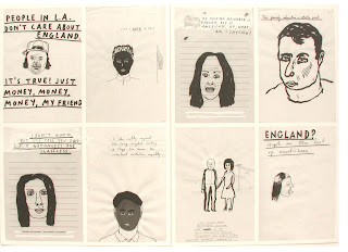
An example of a practicing artist utilizing this method is Paul Davis, whose notebooks are always in use as a creative personal record; stemming from the sights, sounds and events of everyday life. His works culminate in a book entitled "Us and Them"- a brilliant example of a body of work that portrays our two key principles. 
The book is inclusive of many observational drawings collected whilst travelling America and England, which have been merged with hand-written text to form a social commentary on the way in which the two countries percieve one another. Davis demonstrated an ability to conduct primary research through his direct conversations, inclusive of inquiries and answers from residents of both countries and subsequent recordings. In addition he collected original photographs for this research; only adding to a diverse original bank of self-collected inspiration for the project. The quick sketches from his notebooks are then constantly added to, with ideas and quotes switching places and mediums, growing larger, smaller or being discarded completely. The artist himself comments on this process with "Notebook after notebook after notebook, because I feel sick when I forget potentially good ideas. I don't slack. I take photographs. I scan. I photoshop."
Through observation and inquiry we see how other's have created and expressed ideas. We see colour, light, dark, opinion, culture, life, composition, emotion, intent; be this in existing art, conversations, nature, lifestyles. We can use this observation and it's subsequent record to create something of our own form of self-expression.
This is what Paul Davis has managed whilst retaining, however, a sense of his audience. His work is not only a social commentary designed to appeal to an intelligent audience with an interest in modern social and geographical relationships but are tinged with an ironic sort of humour. The artist knows that his images are somewhat crude and so fuses this with similar typography and correlating quotes of a naive nature to form a neat visual package with clear communicative intent.


 Knowing that his audience will mostly consist of the English, his take on Americanism learns towards stereotype, although is valid as he has conducted primary research and collected additional quotes himself. His books are provided as an unusual form of visual entertainment for the audience, many of whom we can presume are broadsheet readers who have viewed his illustrations accompanying articles. This audiences' opinions are similar to his; they understand his social commetary through simple visual message encoding; the creation of a 'smile in the mind', a feel of belonging to a group whose voice is correlating, of intelligence regarding social geographical issues. We can tell this as in his other book "God Knows" the artist reveals his belief that “Corporate American hell is winning”. This would be an unusual statement for an artist with no intent to portray a social commentary, thus he is demonstrating a faith in his audience to agree and presume that one reason they view his work is on common political grounds. Therefore, it is continually published in the same manner.

ITAP Week One - Connectivity

Key Principles:
  • Notions of Originality  
  • Can recontextualised ideas be contemporary?
Defining the means of the originality of something; be it a means of visual communication, spoken word or abstract thought, can be difficult as we are constantly bombarded by existing influences. We retain these consciously or subconsciously to be applied in our own lives - be it through an opinion, way of thinking or the way in which we express ourselves generally and artistically to others. When creating a visual communication, often there is a discreet balance between self-inclusion and homage that deems not many contemporary images truly original. However, can we say that anything created by man is truly original?
Take an example: The man who first made images or marks on rock or ground, distinguishing existing objects such as trees or animals, was only original in a material sense as all his ideas we pre-existing in nature. Therefore we can say, that unless a person has never been exposed to the world beyond their mind, no work can be 100% original. Visual Communication can however, be a great tool to express new personal, social, political and cultural ideas, and which placed in different contexts, can become contemporary rather than directly unoriginal.

Take for example this music video still from Bob Dylan's 1965 track Subterranean Homesick Blues:

Literal signage has been used for thousands of years to convey information, but here it is used as a tool to accompany musical expression. This still in particular is tinged with irony. The musician himself is putting across a persona that is not commercially viable, yet it is within a video to promote the sales of his own music. Is the artist subtly mocking his audience, his label and the wider commercial music industry by portraying his opinion in this manner? This is where a notion of originality is put in place, as the signage tool becomes less literal and opens up an array of wider social and cultural contexts regarding celebrity and entertainment; bringing an otherwise unoriginal form of communication into more contemporary territory.


More than 40 years later, Gillian Wearing further demonstrates the use of subject expression through signage in her series of photographs: Signs That Say What You Want Them To Say And Not What Someone Else Wants You To Say. This visual social commentary includes the image below right, which along with the Bob Dylan still is has ironic intent. The child has written out a passage from the Bible. He is using existing words as a form self-expression, directly juxtaposing the series' title. Again this shows originality in an old idea; the message is visually conveyed almost identically, but now contains a religious commentary that remains contemporary.


The final example of how a recontextualised image can be contemporary is shown above left and is a 2009 Government Advertisement. It utilizes modern photo editing techniques to draw attention - the foreground is sharply focused; this man is an individual; this is his opinion. Again a social statement is made but with the intent of informing and provoking action through personal experience. It demonstrates the second key principle through fusion of literal signage, personal opinion, modern photographic techniques and it's overall advertisment-based intent.